
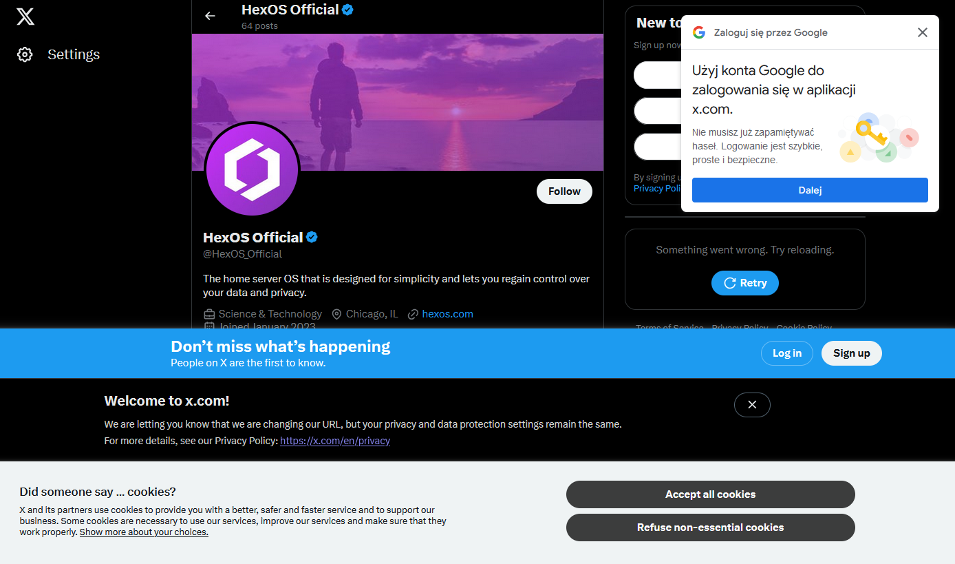
I happened to click a link that took me to the associated twitter X account for something I was interested in and was greeted by not one, not two, but four modern day web popups.
I know it’s nothing new. I’ve got a couple of firefox plugins that are usually quite good at hiding this sort of nonsense, but I guess they failed me today (or, I shudder to think, there were even more that were blocked, and this is what got through)
What’s the worst new/not-signed-in user experience you’ve encountered recently?
That screenshot looks like the old screenshots from the early browser wars with 20 toolbars stacked.
And dancing desktop buddies with 350 tray icons.
Anyone else missing Bonzi Buddy?
The absolute lack of any kind of consistency with layout or alignment makes me cringe too.
It’s just shows how they’re just glued onto the page with no care or planning. Especially no consideration to the user or user experience.
I’ve been saying the same for tv commercials. I’ve always hated them but they were built into the episodes, now they jump scare mid sentence and come back to another speaking.
I sail quite often but the wife likes the convenience, so.
It all sucks and getting suckier!
Oh I didn’t even notice that, now I can’t unsee it. Thanks (I hate it), I guess?
The absolute lack of any kind of consistency with layout or alignment makes me cringe too.
My guess is they’re all built by different teams that didn’t reuse any of the code written by the other teams. Ideally you’re supposed to have a design system with standards for this, but I think all the good developers left (or were fired from) Twitter when Musk took over.
Yeah I agree
The web. It was good while it lasted.
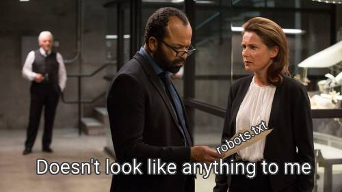
robots.txt is the perfect summary of the web era. A plain text file that politely asked web crawlers not to do certain things. Such an innocent time.
I LOATHE that fucking google sign in overlay.
Omg fuck that thing so hard I hate it
Hey you want to read this article why don’t you sign into Google? Why I can already see it
Then companies like…“dont use adblock”
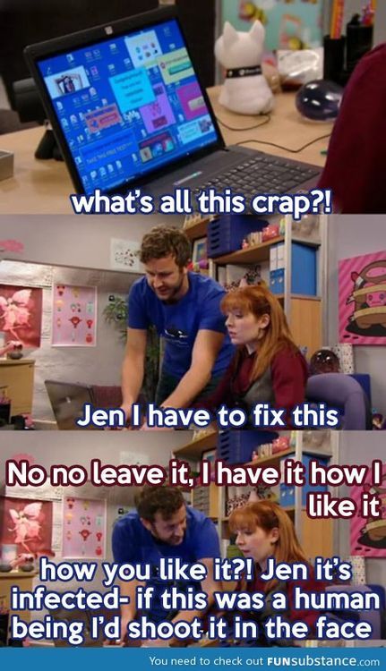
If this was your webpage 15 years ago, you’d be almost certain that you’d been infected with malware.
There was a screenshot I once saw of a Chinese netizen’s web browser in the late-2000’s, using Internet Explorer 6 and tonnes of third-party toolbars. I think I saw it back when Digg was still a thing. We’ve now reached the age where major websites are more cluttered with notifications than a malware-infected browser was 15 years ago, and where everybody is tracking everything that you do online.
25 years ago, we legitimately drove RealNetworks into the ground for a lot less than what we’re allowing Google, Microsoft, Meta, X, etc to get away in the modern day.
I really really do miss old school internet and feel kinda bad for people who never get to experience it. I know i sound like a cunt, and maybe it’s just nostalgia, but when the internet was bound to a computer and it was mainly “nerds” using it, it was such a better time. I remember a time where the internet was fast enough for pictures and small videos, but having your own picture somehow on the internet was witchcraft to me. Scanner, cameras who are digital whaaat? Now most of the internet is ads and pictures of people who i don’t give a shit about. People’s opinion, picture of people, fuck off bring back the time where the internet was either forums or someone’s weird website, where you only stumbled upon because you typed in a web adress i. The hopes it leads you somewhere.
I had a girlfriend who was truly fascinated by the fact that i don’t have social media and that i’m not “on the internet” like she didn’t find me and my stupid face anywhere on the web. She was often wondering what i was doing on the internet if i don’t have social media, because that was the internet to her. Facebook, instagram, tiktok and youtube.
Whenever I get to a webpage that looks a decade old (like most recently Ventoy) I get hit with a wave of nostalgia. Yeah, it might not look great or be very responsive to my actions, but my god does it feel great to just get thebinfo you need front and center.
She was often wondering what i was doing on the internet if i don’t have social media, because that was the internet to her
~ shudders ~
Please unblock challenges.cloudflare.com to proceed
(grumble, unblock, reload)Verify you are human
(click)…spin…spin…spin…
Verify you are human
(click)…spin…spin…spin…
Verify you are human
(click)…spin…spin…spin…
Verify you are human
(click)…spin…spin…spin…
Verify you are human
(click)…spin…spin…spin…
https://privacypass.github.io/ has helped somewhat
Privacy Pass will generate a number of random nonces that will be used as tokens
British people making a double take
Privacy Pass just randomly generated Prince Andrew and now my browser is all sweaty.
Interesting. A quick look at the description makes me think it could help with the inconvenience problem, but probably not with the allowing javascript problem. Still, I’ll have to take a closer look. Thanks for the link.
Edit: Turns out it requires installing a browser extension. From Cloudflare. No thanks, but I’ll give it another look if the protocol ever gets implemented by browsers.
You forgot:
Click all the pictures of buses.
(clicks)…spin…spin…spin…
Click all the pictures of bicycles.
(clicks)…spin…spin…spin…
Click all the pictures of traffic lights.
(clicks)…spin…spin…spin…
I didn’t forget; I just chose to highlight Cloudflare’s awful captcha instead of Google’s awful captcha. :)
Click all the objects heavier than this one
…spin…spin…spin…
… Spin … Spin … Spin …
… Remember that you turned off your VPN
… Turn it on
… CF: OK, only humans use VPN, no need to show the challenge
This kind of thing getting worse and worse at all levels of tech is increasingly pushing me to the fringes of tech solutions (with all of the handicaps that come with that) as those are getting to be the only places where this kind of thing is not pervasive.
- No apps on phone, if the mobile site doesn’t work it can wait until I am in front of a desktop/laptop
- No NFC payments as that requires the phone to be blessed by lord Google or father Apple
- No set top streaming boxes on the TV, just a small Linux powered PC and a cheap Logitech wireless keyboard/trackpad
- Only Linux OSes on desktop/laptop
Yup, I’m in exactly the same boat. I just got a new phone and decided to not install any banking apps whatsoever. I got a check in the mail, and instead of giving in and installing the app, I just drove a mile to an ATM. NBD, and I don’t have to see endless nags about banking features, credit scores, etc.
I’m not part of your system… MAN!, but actually serious.
I have found that local banks like credit unions, and such, seem to have nicer mobile apps from my experience.
I have worked as a software engineer for a smaller bank like this, and the development was a lot more honest. These kind of banks normally just want a pleasant user experience for their customers, unlike bigger banks that want to deploy all sorts of dark patterns to collect user data and sell extra stuff to their customers.
At least you can force desktop mode on most sites. No mobiles apps, desktop mode on phone. Usually.
I’m headed in that direction.
- Minimal apps on my phone, most of them foss apps to access my self hosted services
- Raspberry pi 4 running osmc connected to our TV. TV itself has no internet connection
- Want to move to graphene os, but riding this iphone 12 mini until it dies
- Linux on my server and my primary computer. Have an M1 Mac Mini that my wife primarily uses (too many papercuts for her with asahi linux. We tried and switched back), and iPadOS on the iPad Pro that I have that I’m also riding until it dies.
X gon give it to ya
I have a very hard time believing that these companies are unaware of how auful this shit makes their webpages.
Anyone can make a good website. It takes a real engineer to make a horrible website that people will use just enough while suffering.
That’s a very good quote.
Inspired from the quote “Any idiot can build a bridge that stands, but it takes an engineer to build a bridge that barely stands.”
Source: Unknown
If this were a competent company, I’d say that they’re entirely aware of it and how fucking awful it is, but that there’s a mandate coming from somewhere that the page MUST include x, y and z and so they add x, y and z but usually try to at least make the site usable.
This being Twitter, though, I’m sure it’s because a screaming man-child threw a sink at someone and told them to do it or they’ll be fired and so they did it in the most half-assed obnoxious way they could manage.
Common language used to dismiss bad decisions like this:
- We need to track and meet our metrics for the quarter
- Engagement for $FEATURE is down, so we have to take measures to get people to take notice
- It’s opt-in/opt-out, so it’s the right thing to do
- It’s only a one time thing and then the system remembers1 what the user selected
- Only new users are affected - our power users will put up with it
- It’s just a minor inconvenience, really
- It’s just a website
1 - Oh, did you turn off cookies or clear your cache? Sorry about that.
Pretty sure you just triggered every developer and/or person who had to sit through a product meeting.
Though you missed the last bullet point: Our user surveys showed that people would actually prefer these changes
Pretty sure you just triggered every developer and/or person who had to sit through a product meeting.
NGL, I was feeling very uncomfortable myself by the end of typing said list. Is it hot in here? I need to lie down.
It’s intentional, they want you logged in so they can track what you’re doing
iT’s bEtTeR iN tHe aPp
They know exactly. Once you create a Twitter account, consent to cookies and link your Google account (AKA give them all your data) you’ll never see these pop-ups again.
Basically extortion.
If you ever want to read anyone’s tweets somewhat chronologically or see someone’s latest tweet, you’re gonna create an account.
Tweets as view on people’s profiles are totally scrambled (presumably to thwart LLM-feeding scrapers).
Oh they’re aware, they just don’t care 99% of the time.
I mean, they kinda don’t. Companies are entities made out of policies guiding how people split up objectives into smaller parts. The more people involved and the more indirect it is, the less coherent it gets
Legal says you need one popup for compliance. Marketing or analytics say you need more users to log in. Elon wants to remind people to call it Twitter.
By the time it filters through managers to the devs, they probably know it’ll be a horrible experience, but what are they going to do? It’s not their job. They’ll get brushed off. There might even be a compelling reason to do it in this way - with this in particular, annoying and intrusive popups are malicious compliance with the EU cookie laws. But everyone seems to be doing it this way - that’s probably what legal is going to recommend rather than interpreting the law themselves
So the problem is the structure. If you want a hierarchy of obedient replaceable cogs, you’ve made sure no one sees the full picture
It’s diminishing customer experience creep, except the company doesn’t understand what the user data means. They run A/B tests of different layouts, seeing what kind of feedback each gets to learn more about design choices and users. Each version should get its own feedback and then that data is compiled by data scientists into actionable feedback, things that can be done to improve the website in the direction the company thinks is an “improvement”.
Twitter abandoned those data scientists with the initial layoffs. There is no one to tell them what works and what impacts the customer experience, which is why each time the internal question of “how do we open up for engagement?” they answer it the same way, “Use existing user bases by linking their account to Twitter.” The result is several login requests all looking for the same cookie.
It’s lazy or inexperienced management. Knowing the type of person Elon hires, it’s probably both.
I do a lot of my browsing from an iPhone 11. At least twice a day, a page will crash and reload halfway through whatever article I was trying to read. I get it’s a few generations old, but since when do you need state of the art tech to view what should be a static page.
EU: “You can’t just collect people’s data, you have to ask permission first and give people the opportunity to decline.”
Site Developers: “Fine, but we’re going to comply in the most malicious manner possible.”
HEY DO YOU WANT COOKIES ARE YOU SURE PLEASE HIT THE BIG BLUE BUTTON FOR COOKIES THEY ARE HELPFUL AND GOOD PLEASE GIVE COOKIES!!!
It’d be fun if the EU started policing any use of the phrase “We are required to show this dialog”.
They’re not. They choose to show that dialog so that they can try to apply commercial tracking cookies. Anything for website function is already covered by EU laws.
There have been a couple of changes to the rule since it came into effect. Originally, the pop up could effectively occlude the “Do Not Enable Cookies” button behind a maze of “Optional” settings. The end result was a big colorful “I Consent” button and a tiny little gear button with a thousand manual checkboxes to uncheck every time you visited the site.
The regulations were updated since. Now these annoying pop-ups at least tend to have a clearly defined “Yes, I Consent” / “No, I Do Not” at equal scale and opposite color, allowing you to bypass it without going into the weeds on a configuration screen.
It’s hilarious on a widescreen setup how many websites aren’t adaptive but that cookie pop-up blocks 3/4 in 5000% font size.
web 1.0 wasn’t flashy but it got the point across. bring it back.
As you wish: https://wiby.me/surprise/
That white text on gray background. What a design choice.
Aesthetic > readability. The user can just select all on the page if they want to actually read it, right?
Edit: It was pointed out to me that this brings up a random URL every time someone clicks it, so everybody is not seeing the same thing. Whoops.
Every time you click that link you will get a different web page… so…
Oh, I see now. I’m dumb. I didn’t realize this just brings up random URLs to web 1.0 pages. Thanks for pointing that out!
Although if you click through a few of them, your comment is probably applicable!
I still prefer readability over aesthetics. There’s many people with disabilities that I hope you never get through what they do. If there’s something to be read that you can barely see, then what would be it’s value?
I should have put a /s because the comment about aesthetic over readability was sarcastic. I was just joking, and I definitely agree with you.
Oh, thank you for the clarification, didn’t wanted to sound mean.
being back walkmans and discmans too
This is the digital equivalent of walking through an open air market and having salespeople harass and follow you trying to sell something
The rare Gigachad double top level comment. Well played sir.
try opening fanwiki in a phone
Oh yeah, these unrelated autoplay videos are a great pleasure to stop and hide when scrolling. Waste of internet traffic.
This is why I avoid Fandom any way I can, largely using this browser extension. https://getindie.wiki/
For minecraft players: Remember to only open minecraft.wiki links
Just gotta love what Elon did with the place. Not that it was great before, but now it looks and feels like a seedy Thai hooker palace


